Ferns & Petals
UX design I Redesign
Project Brief:
The Ferns & Petals app needs to be redesigned to be user-friendly and intuitive to users across different age groups in urban India. The redesign project must follow a user-centred design approach to deliver a best-in-class mobile application that fulfils user needs with a better experience and leads to more orders and downloads.
Synopsis:
Under the guidance of Tanvi Purohit, my graduation project was completed with ZEUX Innovation. The aim was to redesign the Ferns & Petal’s app. It’s an online Indian gifting company that started in 1994. The following project is an industriaL-based project executed at ZEUX Innovation, Mumbai.
Duration:
January 2023-April 2023
FnP is synonymous with love, emotions and celebrations.
Project brief:
Ferns N Petals (FNP) is India’s largest online flower and gift delivery service with franchise stores across India. It's also one of the largest flower retailers in the world. The brand has served more than 6.1 million customers both online and offline.


Stakeholder Analysis
The answers, suggestions, and opinions of our stakeholder have been curated and summarised below
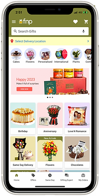
UX study of the existing app
Since it was a revamp and redesign, it was necessary to study the
existing app. We looked at almost all journeys in the app to test the UX hygiene of the product.
Image courtesy: F&P app

Icon Positioning
The icons are positioned hierarchically.
Hero Banner
The hero banner justifies its position by displaying the ads.
Usage of colours: The use of colours is extensive. There's no design system followed.
Inconsistent cons: The icons on the footer are inconsistent. They don't belong to the same family.
Inconsistent type: The typeface throughout the application is inconsistent.
Hamburger Menu
The information is not categorized. Moreover, the icons are inconsistent.
Categorization
The products can be categorized. To improve the, products can be sorted different categories such as, plant pots, bouquets, cakes and confectionery.


CTA position
The CTAs are sticky on the footer making it visible at all times. Crucial information about the delivery time is also mentioned just above the CTAs
Price Information
The information about the price of the product with discount is well organized.
Competition Benchmarking
In an ever-changing industry, there are always new innovative ways to expand your strategy to stay ahead of your competitors as well as keep the attention of your customers. The purpose of a competitor analysis is to understand FNP’s competitors’ strengths and weaknesses in comparison to the other gifting companies and to find a gap in the market.

User Survey
App development is not just about creating a product but about solving a problem for users. As an essential part of human-centred design, user research helps us to understand users’ problems and create solutions that directly address them. We interviewed a total of 8 users across India.
User Mix
16-30
30-45
45-60
5
Mumbai
2
Pune
1
Bengaluru
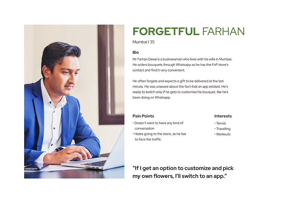
Persona Mapping
This data segments ideal users and ensures you’re building products that are empathetic, inclusive, usable, and retain target customers or existing clients for the long-run. Persona mapping was done keeping in mind the users we interviewed.


8 Keys
For a better gifting app experience
• Get the visual design basics right
• Be visually compelling
• Don't just inform; educate the user
• Add social proof
• Create a unique, engaging gifting experience
• Make sustainability a part of your brand promise
• Highlight different ways to navigate products
• Enhance the emotional quotient of gifting
Ideation
For a better gifting app experience. Incremental innovation is a small, modular change that takes place slowly over time. Disruption is a change to the market that is so powerful and different.
The following concepts are created keeping in mind the incremental and disruptive factor. Concept 1 being on the incremental side whereas Concept 3 being on the disruptive side.


Concept 1
• Inspiration was taken from what users like using daily-Instagram’s discover page
• Based on the location/pin code the user enters, the products would change
Concept 2
• Give users the option to shop and browse through various categories
• Allows users to try different ways of navigating through a playful interaction
Concept 3
• Translates the beauty of nature with bold and full-bleed images
• 3 CTA’s that is most used by
FNP customers


Concept 3 was selected by the stakeholder.


Landing page
Once the user completes the onboarding screens and signs up for the same, they land on the homepage. The idea behind keeping this page a no-scrolling interaction with bold images was to grab the user’s attention.
The app has three CTA’s which users usually look for when on an FNP app. The user clicks on “Browse by Category”and enters a delivery pincode. The landing page would only show the products that are available in that location.
Users get to shop by various categories like
What’s Trending, Shop by Product, Customise, Shop by Color, Shop by Occasion, Shop by Season
Shop by Combos.
Customization
Customization of hampers and bouquets is a great way to help users create a personalized gift that’s perfect for any occasion.
It begins with choosing a hamper or a bouquet. In this case, it customising a bouquet. You could either choose a base or flowers first. The user could also add some fillers if necessary. Followed by check out and payment screen.

Old VS New
Here's how we've transformed your experience:
-
Streamlined Interface: The old design, while functional, lacked fluidity. The new app brings a seamless, intuitive interface that’s easier to navigate and more visually engaging.
-
Enhanced Features: We’ve optimised core functionalities, addressing previous bottlenecks, adding new features to ensure a smoother, faster, and more reliable user experience
-
Refined Aesthetics: The previous design’s visual elements have been revamped, incorporating modern color palettes, cleaner typography, and a more cohesive design language.
-
User-Centric Approach: Based on user feedback, we've prioritized accessibility and personalisation, allowing you to customize your experience with ease.


